Tab Slider - tagline : Section 1
Circle overlay - left side.
Read more
This is the overlay text SQUARE on the right side.
Test Lightbox

subtitle possible (Font Sizes TBD)

Overlay left - will put a background color (defineable for entire module - not on tab level) over 50% of the image and display text on it.

HEIGHT of image is flexible but should be same for each tab.
Read our research
Circle Slider - Tagline 2
This is a plain text field. No formatting possible. (Maybe with insertion of HTML commands for breaks. Not necessarily advisable as this section will be used also on mobile and might look strange.)

Text can be as long as needed, but please keep in mind that all other sliders should then taske up as much text space, so it looks okay. Otherwise there will be a lot of unused space on the next sliders.

The hand icon is PNG 230x230px with complete transparency
LinkText - can be defined per slide
Another slider - without linking to another article.

BUG: the icon should be always in the middle. Behavior should be as on the live Aquaphor landing page. Link below. Click on CTA to get there
Check out life behavior on Aquaphor Page
images background 1880 x 830
READ THE TEXT
The background image space has an automatic width restriction. It will automatically adjust the width to the slot.

The LENGTH is FLEXIBLE - however - make sure that the images are ideally all the same length otherwise it will look weird as the icons in the gray slider will adjust to the longest item defined!!
TEST Find out how.
Lorem ipsum... Test image 400x200
Find out how

SOS care

Help is just a fingertip away
How it works
1
Order Elements (1,2,3 or a,b,c) are optional. List is not limited
2
The round images are currently a size of 420x420 px. Transparent background PNG
C
No linking for this bubble
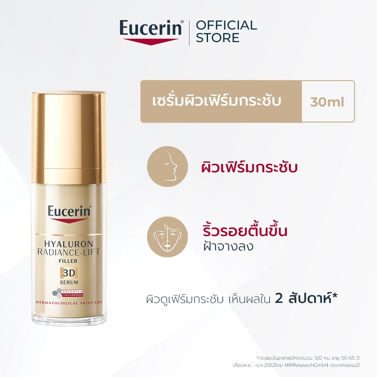
ลงทะเบียนรับข่าวสาร

กรุณากรอกข้อมูลของท่าน เพื่อรับข่าวสาร และโปรโมชันใหม่ๆ จากทางยูเซอริน

  • ผลิตภัณฑ์ใหม่
  • ร่วมกิจกรรมพิเศษ
  • รับข่าวสาร และคำแนะนำ